Consumers favor minimalist environmental packaging
this is a look at the age of the age.
what kind of skin care package do you like to see? Bri-gitteEvard, co founder of
International Packaging Design Award Penta-wards, thinks packaging design is a rigorous and difficult rule. It follows the rules of the market, and at the same time, we should pay attention to controlling costs and increasing profits.
as consumers become more and more smart and picky, it is becoming increasingly difficult to win their trust in a product.
respond to this change, the brand and designers in the packaging strategy is to show the product is very sincere, let a person feel it is not only "genuine" and "making it very carefully".
, if you pay attention to the new products of cosmetic counters, you will probably find that gorgeous, feminine packaging is no longer the weapon that attracts the women by skin care brand.
love "Yimaoquren" women in this year’s new products, will find the natural cosmetics packaging style minimalist, become the weapon suction eye 2016-2017 years of personal care products market.
is the first color.

according to the color test showed that the observation of objects in the normal state, the initial observation, the observer 80% colors to attract attention, this process continues for about 20 seconds.
therefore, color determines the first impression of the consumer 80%, which is the most prominent element in the product design.
makes the eyes look more comfortable, becoming the first choice of many brand designers, such as beige, white, light pink and wood color. These colors make people feel soft and more acceptable. In addition to the color that looks comfortable,
is one of the most important features of skin care packaging at the moment.
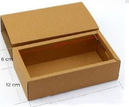
in the last two or three years, the kraft paper has been hot.

from a technical level, it has good elasticity and toughness, and can be recycled, environmentally friendly packaging materials, but also can embody natural products simple, company" sense of responsibility to protect the environment".
in fact, many international brands from the beginning of the packaging design, it is very important to focus on the theme of environmental protection.
today, the "natural" design trend is beginning to return to the consumer vision.
more and more personal care products want product packaging to return to real, natural material, so that consumers can create a sense of trust and create a comfortable and leisurely atmosphere.
and packaging, there were more and more handwriting or illegible, like a pen made doodle irregular, with more natural environmental protection material.
shows the true sense of the product and the handicraft, and emphasizes that it contains the personality and temperature of the person, hoping to establish an emotional connection with the consumer.
unique shape.
more and more designers are thinking about the form or appearance of packaging, not only thinking about how to make people remember this brand easily, but also more concerned about how to improve the efficiency and reduce the burden of customers.
, after all, distinguishes the product from its competitors, in addition to its beauty, and its practical function, which is also suitable for packaging.

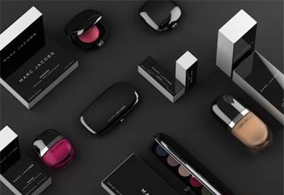
MarcJacobs a recent series of cosmetics packaging because the shape is completely simple to be praised.
metal surface texture, smooth smooth, plump lip pencil shape looks cute, holding with the feeling is also very good.
, the change of goods packaging in a market can also reflect people’s attitude towards life. Life is a simple return to nature. Why is it not people’s wishes?
 International site01
International site02


